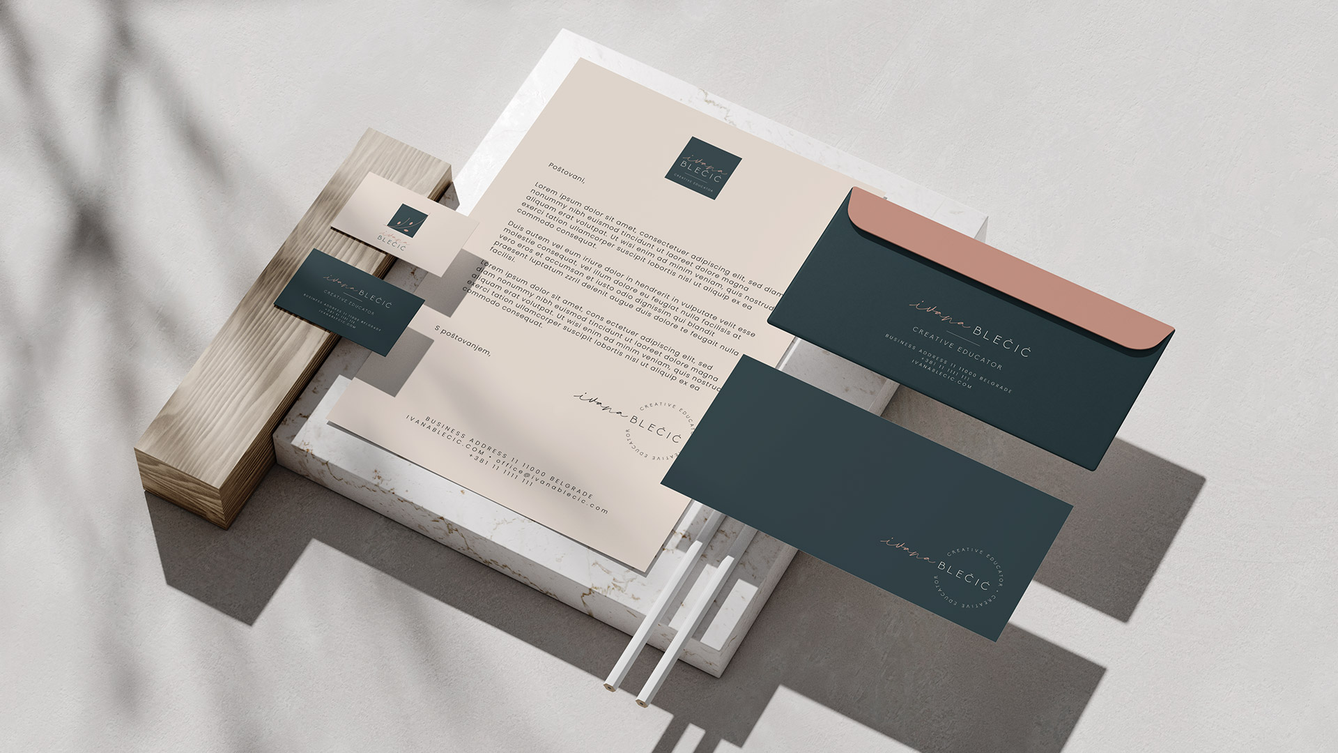
Ivana Blečić je direktorka ljudskih resursa, biznis kouč i spisateljica. Priznata je u mnogim različitim profesionalnim oblastima, a njeno ime je samo po sebi brend. Bila joj je potrebna vizuelna reprezentacija njenog brenda koja bi mogla da obuhvati njen identitet i misiju – pružanje podrške pojedincima i timovima u rastu i razvoju kroz obrazovanje, obuku, motivaciju i koučing. Za nju, ovaj brend predstavlja pomirenje suprotnosti – s jedne strane, puno znanja, informacija i strukture, ali uz puno podrške i vere u ljude i njihove kapacitete kakvi jesu. I to je suština onoga što vizuelni identitet odražava – biznis i struktura u simbiozi sa duševnošću i altruizmom. Samo razvojem obe strane osoba može da raste.
Pomirenje suprotnosti predstavljeno je kroz piktogram – struktura i senzitivnost, prave i krive linije. Kvadrat predstavlja biznis, znanje, informaciju i strukturu. Tanka grana simbolizuje nešto organsko, rad na duhovno-emocionalnom planu. Grana je u obliku krive koja predstavlja rast, razvoj i uspeh. Glavni koncept se takođe nalazi u logotipu – skript font za ime kombinovan sa sanserifnim fontom za prezime, jedinstvo mekog i krutog, slobodoručnog i štampanog. Nežne, ženstvene boje u kombinaciji sa tamnijim, ozbiljnijim tonovima, predstavljaju koegzistenciju emocija i logike unutar jednog entiteta.


